Posts

Showing posts from April, 2024

Ideas development on poster design + research

Image
I was looking for inspiration in Google.  I tried to implement these ideas to my future design.  I like the idea of Milton Glaser, composition is centred, the mix of fonts is interesting.  I like the mix of colours. Two of accent colour and black and white. The composition is very clear and balanced.  This tourist guide is really interesting, with a lot of images, but it is too much details. I would use the idea of the photo and 3 circles in the middle.  In my next post I will show the first prototypes of my banners. 

Colour development

Image
Colour is a one of the most important elements of a brand identity. The message directing by colour could play a negative role, if it was used with no previuos research, or just picked wrong. For my project New Cromwell I tried a multiple diffrerent colour palletes and decisions. Please find the pictures below.  From the very beginning, I tried to use colours which will remind people about the fire, using a gradient colours. Afer the tutorial I was advised to have a look on a Connecticut flag, so I tried to use a colour pallete from this one.  Trying to combine Strong colours such as blue, dark orange with light and gentle colours such as yellow tint, greenish white and orange tint.  I coloured the slogan in greenish white and put the whole logo on a dark background. Using orange on a bird makes logotype be bright, challenging and strong. Adding a dark blue to show the accent, as these two colours are complementary. Adding a yellow makes the colour palette turn to split-complementary. 

From ideas to research

From Ideas to Research - Research Sheet.docx  

Tutorial results and visiting the workshop

Image
On the week three I had a tutorial with my tutor, whete we had been discussing my futher actions, possible development on my work and results I can achieve. I was suggested to visit the 3D workshop for my final outcome of 3D sculpture for the city. I went to the 3D printing workshop, spoke with the technician, who suggested me a few options. The first option is to create a sculpture from arcylic. The second option was to create sculpture from metal. I shown my project to the technician, and according to my design, the lines were to thin, so I has to create outlines from my design and after edit the lines, make them ticker. Throught my development, I realised to edit my lines using a smooth tool. The typography in my design (stand) is a bit different from the original logo, which I will explain in the post about choose of typography and fonts.   As I was recommended to make a box under the logo, so then it can stand on something.  Also, I will use the emroidery technique for the logo in

Research on city branding

Image
Update from 28.04  As my subject area is graphic design, I will be working on city branding, especially logo design, and posters. The main point of successful city branding is in purpose. Who is this branding for and what it must express ( Dawood, 2023).  My target audience is previous  residents of the city and tourists. I took all my attention to the idea of a logo. I wanted to make it clear, but unique at the same time. In terms of this, my branding will be original and successful because of its strong background. For the target audience (residents) branding will show the power of the city, that it did not die, only became more strong. All the symbols in my logo idea (please find in previous posts) reflect the story and sympathy from the past. According to that, working on my slogan I decided to show it more to tourists and to remind them with a little bit of memories about (not the tragedy) but about success and how we went out of this situation and became even more strong.  If it

Art Portfolio Project Plan

Image
Project outline https://docs.google.com/document/d/1C5m_fLBlWXMbwqkDNUvOYdJSzd0Dt_v5/edit?usp=sharing&ouid=102918571374645899797&rtpof=true&sd=true

Research (Artist)

Image
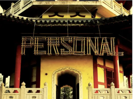
Edited on 28.04  On the week 2 I was given an artist for research. It is a Austrian graphic designer and typographer.  This artist connected with my work for his brilliant typography works. As on a week 7 I will create a 3D welcome sign for New Cromwell, and Sagmeister really inspired me by his transparent technique. Stefan Sagmeister is known for his work "Things I have learnt in my life so far". There is a series from things, which he learnt from his life, putting it into the typography design and making even sculptures from letters. I am interested in his design wor for his ideology. Also I have a lot of in commowith  his phylosophy, which can be viewed through his works. This work created from wood sticks, transparent and seethrough.  According to the fact, that Stefan's designs were focused more on typography, which directly relates to my work. As a part of my major project is to create a logotype, slogan and sculpture, and I was inspired by Sagmeister, so I willing

Slogan generation

According to the previous post, I started creating a slogan for a New Cromwell. Here are my first thoughts: The first ideas for a slogan: 1. Where flames birthed a new beginning. This idea expresses a birth, a new beginning after a tragedy.  After I tried to make the slogan more specific and simple. I was inspired by the Great Western Railway slogan "See it, say it sorted". 2. Rising, Rebuilding, Reborn. Then I was trying to put the symbolism of Phoenix.  3. From ashes to ambition.  4. Where Flames Forge Futures. To mix together two ideas (flame) and (ambitions) I created the next one, which makes the people of Cromwell proud of themselves.  5. We used the tongues of flame to climb the pedestal. Also, I tried to create some ideas not related to the fire. Just something motivative:  New Cromwell: where dreams take root. New Cromwell: where opportunity awaits. New Horizons, New Cromwell. Update from 21.04:  After the session with my tutor, I decided to end up with Reborn, Risin

Ideas developent 3

Image
Update from 24.04  On the week 2 I was working on my ideas development. Using Adobe Illustrator I ended up with a American Robin symbolim and A map of New Cromwell as main elements. In the class I have been speaking with my tutor and course leader, I was working also in collaboration with craft designer Aleksandra. After taking their opinions, which is a part of my goals for this term (tale another's people opinion) and not to stick to only one design concept, we ended up on this design version. I will show the process of my work and some experimentation.  I started with simple sketches using the american robin, as it seemed as a strong element. I was inspired by actual american robin front face.  I tried to draw detailed face, using a pencil I started drawing.  I had a few different idea for logo.  I experimented with a shape and, text I tried to draw it with open mouth.  I developed the idea, made it more clean, with a determent stroke.  Using a pen tool I draw simple shapes star