Colour development

Colour is a one of the most important elements of a brand identity. The message directing by colour could play a negative role, if it was used with no previuos research, or just picked wrong. For my project New Cromwell I tried a multiple diffrerent colour palletes and decisions. Please find the pictures below. 


From the very beginning, I tried to use colours which will remind people about the fire, using a gradient colours.


Afer the tutorial I was advised to have a look on a Connecticut flag, so I tried to use a colour pallete from this one. 


Trying to combine Strong colours such as blue, dark orange with light and gentle colours such as yellow tint, greenish white and orange tint. 


I coloured the slogan in greenish white and put the whole logo on a dark background. Using orange on a bird makes logotype be bright, challenging and strong. Adding a dark blue to show the accent, as these two colours are complementary. Adding a yellow makes the colour palette turn to split-complementary. 

Using independent greenish white to create a uniqueness of the colour decision. 


I experimented with the colour wheel, colour tints and shades. Using a tint colour pallet, the logotype seems more playful and childish, while we need to express its strength. The right logotype, when I used dark black, blue, and brown tints, looked overloaded and aggressive, which is not good as well. 


The left one, where I experimented with gentle pink colours, green-blueish, and white-pink. Using these colours does not really solve the main idea. 

Most likely I will end up with a blue-orange-yellow split complementary colour palette from above. 

In my next post I will show the typography development and use a completed logo on advertising materials. 


Update from 4.05: 


This week I was working on colour development in real life. Sometimes it helps to generate new ideas, to invent new colour tints and shades. 


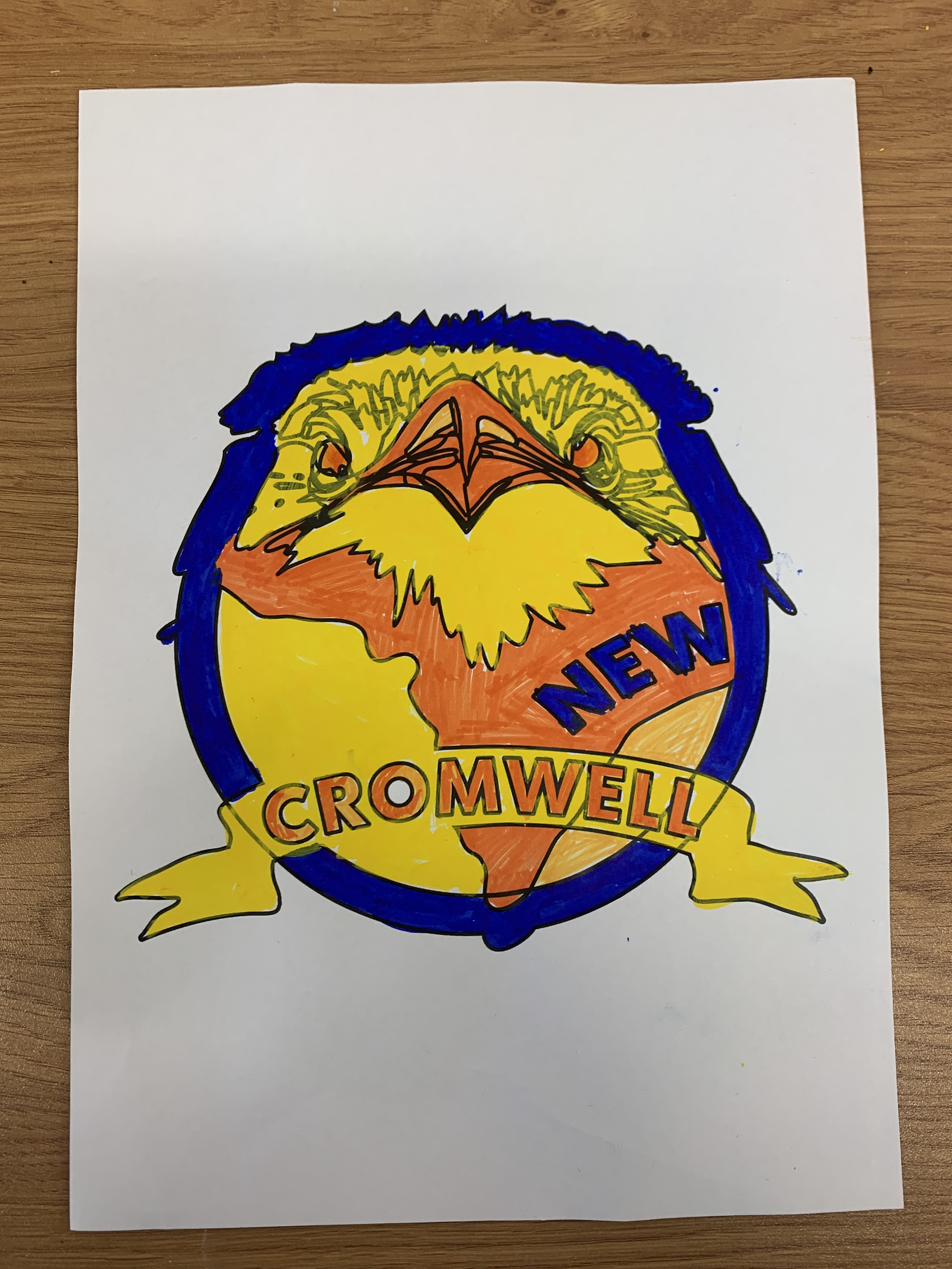
Using soft pastels and watercolours I did experimentation with the colour. Unfortunately, I did not pick these colours for my version of the logo, as they are not suitable for my ideas. It is harder to mix colours in physical life than in digital, as it is timeconsuming and you do not have any chance to change the colour, But digitally you can change the colour easily.